

To kick-off our awards this year we wanted to focus on some of the obscure (but very important) components of running a breaking business. There is a lot that goes into maintaining a successful and well-respected breaking business….just any of the veterans of the hobby. But what can go unnoticed sometimes is all of the uniqueness of the breakers’ branding. And…nothing speaks to the brand more than a breaker’s logo. So we present to you our 1st annual Top Breaker Logo award!
THE CRITERIA
There are a LOT of superb logo’s in the breaking world, so we tried to look at them from a consistent set of criteria. We judged them across three different criteria — Uniqueness, Memorable, & Fun Factor.
Uniqueness: we looked for logo’s that weren’t ‘cookie cutter’ and brought in the personality of the breaker. Having just text wasn’t good enough to get a high rating in this category. We needed to see some flavor that showed who that breaker really is..
Memorable: Did we think about this logo again? Can we quickly recall the logo for a particular breaker? Is it something that we’d want to see again? Those are the questions we asked when grading in this category.
Fun: Did it bring a smile to our face? It is something that you’d want to see on a shirt? Simple questions to gauge how “fun” we thought the logo was.
We took the total score from all 3 categories and came up with our Overall Score. So we present to you the Top 5 Logo’s:
#5: Minera Sports Cards
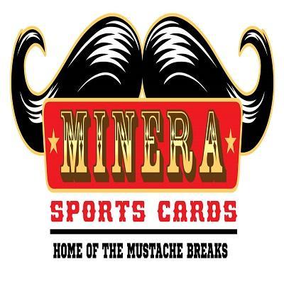
Breaker Page is HERE.
Overall Score: 11 out of 15 — with a perfect 5/5 under the FUN category.
I mean come on, it’s an oversized mustache as the backdrop. They market around the mustache and have created a unique identify. The branding is spot-on and epitomizes what Minera is about. I’ve always been a fan of the logo and was not surprised to see it land in the Top 5!
#4: Monster Breaks
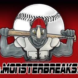
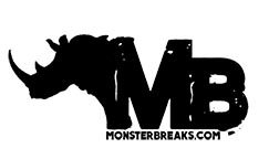
Breaker Page is HERE
Overall Score: 12 out of 15 – with a perfect 5/5 under the UNIQUE category.
This Chicago breaker actually has a couple of pretty sweet logos, both of them incorporating a fierce rhino into the design. This is one of those logo’s that is awesome on a T-Shirt (they do sell on their website)…and could easily be confused with a trendy skateboarding brand. Awesome work on this logo!
#3: Liberty Bell Breaks
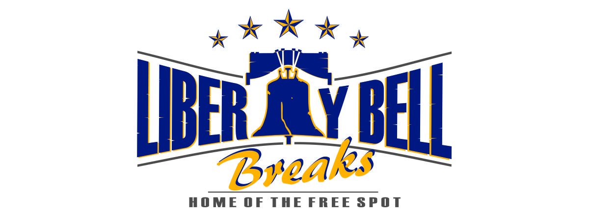
Breaker Page is HERE
Overall Score: 12.5 out of 15 – with a perfect score under the MEMORABLE category.
This was a gimme for the Top 5. When I think of Liberty Bell Breaks I immediately think of the “Bell” at the heart of their logo. The design is creative, absolutely memorable, and crucial to the identity of their brand. Definitely a logo that is so good that is makes you want to invest a $ buck with them!
#2: Red Zone Breaks
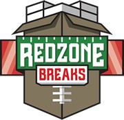
Breaker Page is HERE
Overall Score: 13.5 out of 15 – with perfect scores in UNIQUE + FUN categories.
What does a football, packaging box, 3200 ct box, and a “red zone” have in-common? They are all portrayed in Red Zone Break’s logo! This is such a great logo. It somehow gives a total representation of the brand (all elements) without being to weighty and convoluted. It’s super fun and definitively unique. Props to the guys @ Red Zone Breaks!
And…. for our Overall Winner for the 2017 Top Breaker Logo Category:
#1: Boomo’s Breaks
![]()
Breaker Page is HERE
Overall Score: 14 out of 15 – with perfect scores in UNIQUE + MEMORABLE categories.
Anyone who’s been in the industry more than 5 years would agree that Boomo has a unique reputation. He’s had some incredibly memorable moments in his breaking career… but gosh darn, he couldn’t have created a more perfect logo! His logo does what every logo should strive to do….burn itself into your brain so that you never forget it again. He has that one logo that I just won’t forget. Why? Because it’s 100% representative of who he is…it’s personal…it’s complete….and frankly, it’s beautiful.
Great job with the logo — you’ve worked some marketing magic!
This year we saw some impressive rookie breakers (you’ll learn more in one of our upcoming awards). One of the easiest ways to grab a quick following is to be unique in your branding. This means finding an identity that is special, working it into your breaks/entertainment, and building on the momentum. There are some incredible efforts from the breaker world…I’m looking forward to seeing what new/revised logos 2018 brings us!
Thank you for reading — be sure to congratulate the breakers on the list! Feel free to leave comments BELOW!
Stay Tuned for our next Award: 2017 Top Video Production
Anyone in agreement?